AT&T Firstnet's Developer Portal
desktop and mobile- website redesign


Project Summary
Client: AT&T hired Sapient to build FirstNet, a project to assist First Responders in crisis situations, to allow them to communicate more efficiently. This is done through the building of cell phone towers exclusively used by First Responders, as well as apps that can assist them in their rescue attempts. My role was to create the Developer Portal, where developers could collaborate and access APIs to build apps for First Responders.
Role: Information Architect
Problem: Due to this project being approved and funded by the government, Congress dictated that the apps are required to have high levels of security. The developers are responsible to go through security checks, in order to have their apps approved for First Responder application. Due to the high standards of these security restrictions, developers are not making enough apps that are able to pass the approval process.
Impact: Without developers creating apps, the project as a whole would fail.
Solution: I provided the client with a login method for developers, in compliance with AT&T's security standards. I also designed a Developer Portal so developers can add members to their team, access API's, and submit their apps. Through this portal, they are able to maintain organization and submit apps with more ease.
Deliverables: Wireframes, Site Map, Desktop, Tablet, and Mobile Prototypes
Starting Point
Finding users: Due to security requirements, AT&T would not allow Sapient access to its users. Without access to users, I had to rely on other means of accessing the site, such as competitive comparisons and industry standards.
Solution: I interviewed Sapient developers to find appropriate terminology, standardized formatting, and received recommendations to other sites they found useful. The issue with the current site was that the "Manage My Account", did not have all the links developers were looking for. The information architecture was seriously lacking in clarity and visually it looked dated.
Quotes: "What is this? I can't find a thing. This is seriously the best they can do? Links on a page?"

Competitive Analysis
Competitors: Competitor research was vital in my research. Through looking at companies in the developer realm, I was able to collect data on industry norms and best practices.
Discovery: What I found most interesting is that most competitors were moving towards a minimalist user registration form. A name, email address, and password are all most require. The system then scans the email address and grants the user access to their company's account.

Security Limitations
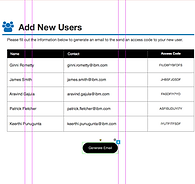
Problem: The idea was proposed to the client that the same type of login could be utilized for the developer portal. However, the client felt that without adding excess information, such as physical addresses, security would be compromised and enrollment ratings negatively impacted. In addition, the client requested a way for admin users to invite people on their team to join, without the client generating or sending any emails from the website.


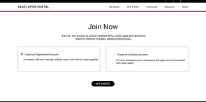
Solution: I designed a multi-step process of signing up developers, admin account holders, and individual unaffiliated developers. An idea of including "mailto:" links became the solution, and these emails would contain the unique security access code but be sent by the administrator's own work email.
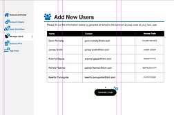
Inviting Users
Wireframe Samples
Wireframes: The wireframes were created using Axure. In total there were over 50 wireframes, excluding the pages that were designed and discarded. Even though wireframes are not meant to demonstrate visual design in general, I did learn the value of clean and consistent design. For example, I made the mistake in earlier wireframes of being careless about the continuity of the font sizes. When presenting the frames to the creative director, the feedback was, "How can I look at your wireframes, when it's screaming at me!" She was correct. The font sizes ranged from 16 to 72. I learned from the creative director and maintained continuity and consistency throughout the wireframes.


Visual Design
Collaboration: Working with the Visual Designer of this project provided me with a great opportunity to understand the nuance of visual design. With her assistance, we were able to discuss the purpose of each icon, the buttons I wanted to draw the most attention to, and how I wanted the user to be visually guided through the site.
Using white space efficiently was given focused priority in my designs. Providing a clean and easy to use space for these developers to collaborate was my main goal.

Client Presentation
Client presentation: I presented the designs for this project each week. In these meetings with the client, I presented solutions, my competitive analysis, and the wireframes for approval. This was one of the many times where my teaching skills aided me in my design career. Presenting my designs was indeed more vulnerable, however being able to stand up, and take another person through my thought process, and show the problem and solution that the design solved, put me right back in my element. The designs were approved, and are in the process of being implemented.


